Twilight Convergence

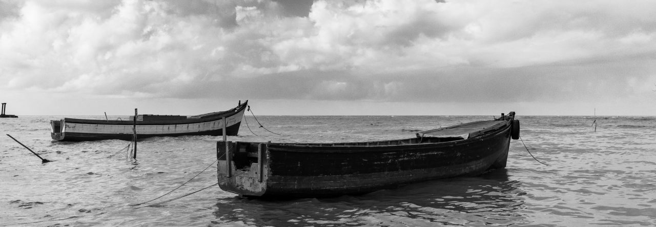
It’s not what I was looking for, but sometimes you have to use what you have and not wish for what isn’t there 🙂  I have been looking in my rear view mirror on my way home every evening for that nice twilight glow, the sunset that has left variations in colour in the sky and the winds that have left scattered clouds or wispy clouds that add that little extra “umph” to the scene.  Well, this isn’t it, but I decided to try a few long exposures and while I was at it, an HDR  🙂

I woke early this morning, and couldn’t get back to sleep, so I came in to process this early, in a standard photograph you wouldn’t see anything in the foreground, but in this HDR quite a bit can be seen, the sky is lighter than the actual scene. but that’s because of the HDR processing, I think it balanced the scene out nicely.


Twilight Convergence - 3 image HDR, 2 stops apart. f/4, ISO 200, 10mm

2011 Deck – Week 2

This last week I took quite a number of photos, and the choice for the image for the deck was a little more difficult.  In the end it came down to a choice of several from the Trip out west that Nikhil, Naseem and I took last weekend.

I will eventually process all my favourites from that trip and load up an album, but for now I will just give you the one I chose for the 2011 Deck as well  🙂

Of all the water crafts that were at the conservancy, one in particular caught my attention, it was a tug-boat (I think they’re called that), it was  quite distinctive from the other shallow boats and canoes on the water, and definitely more appealing than the barge that was moored nearby  🙂  It reminded me of cartoons I watched as a child, and I fully expected to see either Bluto or Popeye on deck!


Ahoy!


Cocktail Umbrellas

Going through some stuff from last year and came across this one, I thought I had uploaded it before, but apparently I hadn’t  🙂

These were nicely arranged on a table that was otherwise filled with plates and condiments of all sorts, and, of course, the birthday cake.

I am still not entirely sure what it was about the arrangement that I liked, except the obvious plethora of colours, that is.  I think everyone likes these little umbrellas, one in your ice-cold drink makes you feel special  🙂

They always look so delicate, a parasol made of paper and cardboard with a toothpick handle, always brightly coloured, sometimes patterned, lending an airy feel as you look at your drink, a feeling of the exotic, as if you should be on a sandy beach, with blue skies above, blue waters to swim in, and some sort of soft Asian or Indian music filtering through the nearby trees to buoy the soul.


Cocktail Umbrellas

A Touch of Colour

I often remark to Nikhil that he should start a collection called “A Touch of Colour”, or in his case “A Touch of Red”.  He usually finds these scenes where there is one item of colour, usually red, that stands out in his compositions 🙂

While processing these two images I remembered what I so frequently tell him and decided to title this blog-post with this same concept.

The first image is an image that has been selectively desaturated to emphasize the Red, the processing is unusual for me but I rather liked how it turned out this time.


Red Cap - selective desaturation

The second image was not treated in the same way, it was of some gaily coloured flowers against an old almost colourless background, I went close with my zoom lens and worked to get some nice bokeh from the background.


Cat-tails

The Parallel Project – Creative White Balance

I’ve been considering a parallel project to this year’s 2011 Deck Project, but I am still not sure if I am going to go through with it.  It was my thought to experiment with different techniques and use the results from those experiments to do the project.

In the event that I do go through with it, this would have been my first image for it  🙂

It uses the idea of using a “wrong” white balance for a scene, to give a different temperature impression, usually to give the “right” impression.

When I was at the wall the place was very cool, breeze blowing in off the ocean, and the rain clouds scattered across the sky, with some blue showing.  The sun was beginning to set and was casting a few (not many) warm colours on the eastern clouds.  To give the cooler impression the white balance was adjusted to give a cooler or “bluer” image.  In the old days this was called “camera tricks”, but it gives the “feel” of the scenery and sometimes that is what is important  🙂


Cool Afternoon

New Header Image

I was recently reminded that I am primarily a Guyanese photographer (yes, I just referred to myself as a photographer) and that my header image was somewhat inappropriate, it being a panorama from Sint Maarten.

So when Nikhil, Naseem and I went for a drive out West on Saturday, I made a point of trying at least one Panorama image to replace the header with.

The header is cropped to fit the available space in the theme I am using, so I’ve included the original below which you can click on to see larger at the site.

This is a scene of the Conservancy down at the back of Canal Number 1, West Bank Demerara, approaching Sunset and waiting in vain for the colours to get more spectacular.  🙂


Conservancy Sunset, 8 image Panorama, 20mm, 1/50sec, f/6.3, ISO200

2011 Deck – Week 1

My first photo for this year’s Deck Project.  I received so much support, feedback and appreciation on the last project that I decided to do it again this year.  I called it The Deck because I was doing one photograph per week of the year (whether it is the best for the week or not), as a year has 52 weeks, and a deck of standard playing cards has 52 cards, not counting the Jokers, I thought the name The 2010 Deck sounded better than “A Photo per week for 2010”  🙂

I also think I learned a little more and got more familiar with my camera a lenses during the year.

Up to now I’ve only taken 42 photographs this week (and I doubt that I’ll take any more today) and those photos cover only 10 subjects, two of which were not meant for the project in the first place, those being some family photos and a house interior sequence.  That left me with only a few choices this week, and you would think that would make it easier to choose, but it made it harder, I was down to four choices, and while I can usually pick one out rather quickly, this week was harder, either the images were all good, or all mediocre  🙂

I ended up choosing this one below for it’s content, I liked how all the pieces fit!  It’s hard to see on the small image here on the blog so click on it to see the image on the site larger.  The afternoon rainy clouds, whiter clouds, an aircraft, a sail-boat, the rock line, a man and his dog, all in one image.  I hope you like it.


A Man and his Dog. Canon T1i, 35mm (Tamron 18-270), 1/400s, f/11, ISO200

The Branching Tree

OK, most trees branch, I know.  But I had a difficult time coming up with a title for the photo, and this one seemed appropriate somehow.

This is a tree on the northern side of The National Park, towards the Carifesta Avenue side.  It possibly fell and continued to grow, growing across the waterway and then branching upwards and out.  It creates a nice shady area, on this overcast day, there was very little light under the tree’s canopy, and I thought that an HDR would be a nice idea, I didn’t have my tripod with me, so I had to hand-hold the camera for the exposures.  The re-alignment didn’t come out spot-on, but it has a softness to the image that I liked.

I’ve had this one since last September to process and finally got around to it, I did no pre-processing in Lightroom, simply carried it into HDR Efex Pro and did the merging there, then a slight crop and rotate in Lightroom, then some saturation shifts and clarity adjustments to finish it off.

It is not a spectacular HDR, but it was geared towards revealing more detail in a very gloomy area  🙂


The Branching Tree
The Branching Tree: 3 image HDR