Lusignan

Anyone who knows me, or has followed my blog or Facebook posts know that I have a particular fondness for the seawalls.  Although I haven’t been shooting much in the last few years, I do manage to get in one or two seawall visits and a few images.  Many people don’t realise that the artistic process is not simple and certainly not infallible, over the years, I’ve accumulated many images, and I can often go back through images I’ve taken and overlooked to find a gem or two.

These two images were never overlooked, but I simply didn’t quite get the feel I wanted at the time, I suspect  my mindset was different and I didn’t see what was right in front of my eyes.  I’ve often looked at images I’ve taken and know that I have “something”, but can’t seem to process is the way my mind or my inner eye was seeing it, so its often a limitation of the mind, or the knowledge to get the image from the raw image into what it was that I was intending to capture and to share.

Lusignan Seawall – 19-6437

One of the things I’ve learned over time is not to force my way to achieve something “artistic”, it either comes or it doesn’t.  What I can do, and what I often do, is to experiment, to play with the software, try various settings and adjust the sliders without thinking too much about it, just adjust on a visual level rather than intellectually anticipate a particular outcome.  What this does if expose my mind to more of what the software is capable of, and also to see changes in the tonality and look of the image that I would not have otherwise seen with my usual predetermined mindset.

This does not necessarily mean that at the end of experimenting that I get a pleasing image, often that’s not that case, and I put the image aside and move on, but I would have learnt a thing or two, which I can apply to other images.  It is also just as likely that I would return to that image at a later date, with some more clarity, possibly because I’ve since learnt something new, or simply gotten a different outlook on the image and what it could be.

Mast – 19-6434

What I have described is one of my approaches to this “art”, and there are many photographers out there who don’t approach it as art but as a profession.  The beauty of Photography is that each of us can approach it differently, and come out of it at the end with unique images, because we are all unique, and what works for me may not work for others, and vice versa.  Don’t be afraid to experiment, it is how we learn.


Choices, choices, choices

choices_KaieteurIf you find it easy to choose photographs for display, exhibition or publication, then you’re likely not approaching it the right way; unless you’ve had many years experience in critically eliminating pieces, I doubt it would ever be easy.

We all have some emotional attachments to the photographs we take, and we have favourites for periods of time, then those favourites change as we add new pieces to our collection, or our styles of photography evolves.

When I started uploading photos online to show family and friends, it was always the pretty photos, this was what photography was for me at the time, all about getting as many pretty photos that others might appreciate, after all, why else would I take photos, right?

As I continued learning about Photography as Art and the Art of Photography, my ideas of what I wanted included in the photograph changed, and the photos changed along the way.  As I keep learning, I am sure the photos will continue to evolve (whether they get better or worse is up in the air at this point).


In late 2011, local journalist Neil Marks convinced the board of the National Art Gallery at Castellani House to host an exhibition of photographs by Nikhil Ramkarran and myself; this was, at the time, the most important decision making we would have to do photographically, deciding what to exhibit.  After consultations with Ms Bissember, the curator at the time, we decided on a common theme that would not have us showing any and everything, but still allow for some latitude to accommodate the diverse style and subject matter of two photographers; titled “Coastal Wanderings”, it allowed us to use imagery taken along the coastal regions of Guyana (although a few non-coastal images did sneak in)

Looking back, I can see my inexperience at the decision making process clearer, but it had a combination of the pretty pictures as well as some that had a bit more depth artistically.  Georgetown and the East Coast of Demerara featured heavily, as that is where most of my photography is done.

Collectively, I think my photos were incoherent, there was no thread that really connected them together well unless you really stretched your imagination.  It was a first showing of the photographs that my friends and family knew me for, with images ranging from Mashramani, to buildings, to flora and fauna, to landscapes; styles ranging from colour to black and white, standard single shot images to multi-exposure High Dynamic Range images, to a multi-image stitched panorama; in short, everything but the kitchen sink.

I don’t regret my choices, it allowed me to learn, especially from the comments made by all, from regular folk just visiting the exhibition to artists giving their own insight into what they saw.


In 2012, there was a return to the arts for the Government as they jump-started the once-abandoned Visual Arts Competition, and this time Photography was included as a category; this was big!  Other than small scale self-serving photography competitions hosted by companies or organisations that were often geared solely to acquiring images for their use, there had never been a proper photography competition that treated the works as art.

The problem of choosing three images from all that I had taken in the last 5 years was immense.   What would the judges be looking for?  What were their ideas concerning photography?  Would they approach it as most people do and look for the pretty pictures, did they want more abstract type images, what type of subject matter may most impress them?  At the time, it was impossible to decide, so I pretty much played it safe.  I submitted the ever beautiful Kaieteur, this was the obvious “pretty picture”, the other two were different, one was “Shooting the Breeze”, a semi-silhouette styled image taken on the sea-wall, and the third was a black and white titled “Final Entrance Opening” that was a personal favourite at the time, this eventually went on to be awarded the Bronze medal.

So, what did I learn this time?  For one, these judges were not looking at the photographs as photographs, they were looking at them as works of art, and that they were not interested in something that is just a pretty picture; sunsets and sunrises, flowers and bright colours were not as effective because they lacked the compositional elements and execution that would have made them better works of art, and not just a pretty picture.


The first competition to focus solely on Photography was hosted by the government in 2014, it was done as part of the Republic Celebrations, and called “Capture Guyana”; this time the tables had been turned on me, and I was asked to be a part of the judges’ panel; I thought that this time, since it is not my photographs, it should be easier to decide, after all, I can look at them without having had any emotional attachment to any of the images.   This was not the case.  Being part of the Guyana Photographers’ group exposed me to the works of many talented individuals, and as we all mostly share our best works, when the submissions were in, I found that I had previously seen the majority of entries.

Having another photographer, formally trained in the genre, and an artist who was not a photographer on the panel made the decision easier; discussions ranged from photographic techniques used, to composition, to the effective use of colour or black-and-white, and many other aspects of the images themselves.

How did we, as judges, choose the best?  I had learnt some things from the 2012 GVACE, so we approached it as “art”, even taking into consideration the photographic techniques used, the primary consideration was “art”;  composition, use of colour, subject matter, lighting, and the other usual suspects.

Whenever there were photographs that I had deeper knowledge of than I thought appropriate, I deferred decision to the other judges, while I think I can be impartial, it was better to be safe and not let my opinions have more weight than they should.


Also in 2014, there was the next iteration of the GVACE, having gone through the choice process for the 2012 GVACE, as well as being involved in the judging process for Capture Guyana, I felt I had a better handle on choosing my images.   Of course, that pesky emotional attachment is almost impossible to over-ride.

I had recently started my first photography project, something I called Oniabo, something that not many people knew I was doing, since I was not sure where I was going with it myself.

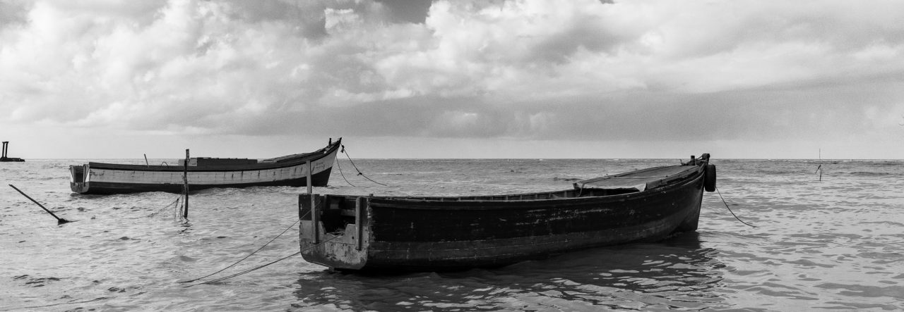
I chose one image from the Oniabo core collection titled “Elemental – 5549”, and one from the extended collection titled “Trident’s Wrath”, both monochrome or black and white images as that is part of the Oniabo theme, and the third image was a pretty picture, one that was sure to garner some attention, a diya and pointer broom, a very Guyanese image I think, titled “Diwali”

As you can tell, I also tried to play it safe as this was sure to be a different panel of judges than the one two years prior, and maybe, just maybe, a pretty photo might be what they’re looking for, I was wrong again.  Although I thought that Trident’s Wrath was more impacting, I knew deep down that the best of the three was “Elemental”; which earned a spot in the short-list of finalists.


Here’s the thing, you can’t predict what a panel of judges may like, unless you know beforehand exactly who they are, and their personal preferences when it comes to art.  The judges from the GVACE 2012 and the judges from the GVACE 2014 chose distinctly different winners, in content and in the type of image executed by the photographers.

Do I know what I may enter this year? Frankly, no.  I think I have one in mind, but three? not yet.

Chose wisely when composing, chose wisely when executing the photo, choose wisely when processing, choose wisely when printing and framing; any photograph that you consider entering is a totality of these things.  Personally, once I have the first three covered, I’m happy, but the final product is something that you are presenting, so the printing and framing are important, you do after all want someone to look at it and say “I’d like to hang that on my wall!”


Click on the images to see them in the collection.

Working with Monochrome

Just a little ramble from me, this is not instructional in the literal sense.  A fellow blogger and photographer, Nigel (or greysqrl) always asked me to write a tutorial on my monochromes and specifically my black and white photographs, but I’ve never felt that I had an “art” to it or a specific sequence of steps in the methodology to really do a tutorial type of blog, so I thought that at least I can do some rambling or musing on the subject.

Back when I shot with the Canon S5 Super-Zoom bridge camera (basically a hyped-up point-and-shoot) there were several colour modes including black and white and sepia, so I had disciplined myself to taking the scenes that appealed to me in these aspects in those modes, so I never had a full-coloured version of the photograph for any sort of comparison.  So for me, the idea of a scene being in monochrome always started out before I pressed the shutter-button.

After I started using a DSLR (for now the Canon T1i or 500D) I learnt about post-processing further, using RAW images, etc.  Now, I still consider many scenes in monochrome and earmark them for that specific type of processing later, but I also change my mind about some scenes that were not considered for monochrome initially.

What makes a good monochrome image?  I really never thought about it, I just “feel” that some scenes make better monochromes than others.  I am sure that as I continue my photographic journey I will learn more about what actually makes a good monochrome, to me it’s a “old” looking scene, or a scene with high contrasts, or in many of Nikhil’s cases one with lots of texture 🙂

How do I process a monochrome image?  Since all my current images start out as full coloured, it is usually that “feel” that helps me select the ones for monochrome, either that or the new method of processing as colour and then it doesn’t quite come out the way I want and I send it over to monochrome just to see what would happen 🙂

I use Lightroom as my primary image processing and workflow application, but the majority of my monochromes are done in Nik Silver Efex (after some processing in Lightroom).  I take each photo on its own merit, some need to be treated softly while others need to be more contrasty and structured.  Nik Silver Efex has a range of presets that you can view easily and then do your own fine-tuning.

With scenes that have clouds (I seem to have many of those now) I always go for bringing out or enhancing the detail in the clouds.  The dynamic range captured using a single exposure is not (always) a true representation of what the human eyes saw or can see.  Often I would look at the scene and see the nice detail in the foreground, then look up and see the layering in the clouds, but when the photograph is taken I lose some detail, and In post=processing I try to retain that detail that I saw.

Dry Docked?

This particular photo was not intended as a monochrome image, the upper portion of the boat (or lower portion in the image, since the boat is upside down) was yellow and I had initially intended to emphasize that, but it didn’t work out as planned.

Intentional Under-Exposure

There was a challenge recently in the Guyana Photographer’s FaceBook page, it was about silhouettes, while there seemed to be various interpretations on the theme, I noticed that not everyone had the same idea of a silhouette.

Although many dictionaries seem to have similar definitions, they usually go back to the original meaning, referring to “cut-outs”, the explanation that I like the best I came across on Wikipedia (yes, I know, not always the most reliable of sources, but its accurate here), “A silhouette is the image of a person, an object or scene consisting of the outline and a basically featureless interior, with the silhouetted object usually being black”.  I think this explanation covers the idea of a silhouette regardless of the medium used to illustrate it.

This image I intentionally under-exposed when I took it to capture more detail in the sky and less in the foreground and objects between myself and the horizon, although I did under-expose I apparently didn’t do so enough since I still had to adjust the black levels to get what I wanted 🙂

Although the tree-line takes prominence in this image, the real interest is the child on the wall walking into the sunset.  Intentionally under-exposing the photograph is one way I know of getting the silhouettes that we try for in images like this.  Getting the right exposure is important, goodness knows I’m still trying with that, but learning when to over-expose the photograph and when to under-expose it can create those moments that are more memorable than an average exposure 🙂

The Walk Home

For a better look, click on the image to see it in the Gallery.

.

One way to do it… Pegasus and the Clouds HDR

I have been asked to do this, so I am obliging 🙂

Let me start by saying “I am not an expert”, far from it, I am a hobbyist who experiments with various forms of photography, I happen to like HDR images although I don’t believe I have yet gotten a perfect one, but I have some I like very much and one that has even been recognised and included in a Best Of HDRs collection on WebShots.

Normally when photographers do a High Dynamic Range (HDR) image, it is in full glorious colour, but I have always been fascinated by the idea that some scenes render better in black and white, and that some of those same scenes may even render nicely in a black and white HDR.  I think I mentioned some of the terminology before, but for clarification I will write this post as if I never did  🙂

What is an HDR?  As I understand it, and HDR is an image that tries to capture as much detail in a scene as possible, especially those in brightly lit areas and shadowed areas.  This is where HDRs work best, in a scene that has both heavy shadow and brightly lit areas.  The human eye and brain is amazing, when we look at a scene, we can see the details in both these areas at once, but a camera usually takes its metering from one area, so if we meter for the “average” light of the scene, we get some blown out areas of highlights and some extra dark shadows, if we expose for the darker areas, all the detail in the brighter areas disappear, and vice versa.

In an HDR, we take at least three images or exposures.  You can take more, I have had limited success with more images and do intend to keep experimenting with that in the future.  The greater the tonal differences from bright to dark in the scene the more images you take the better, or more precisely, the more variation in the exposure from image to image, the smoother the transition in details from light to dark will be.  For the purposes of this blog-post I confine the description to the three that I took for the “Pegasus and the Clouds” photograph of my previous post.

I use a Canon Digital Rebel T1i (also known as the EOS 500D in Europe and the KissX3 Digital in Japan), it is my first SLR camera, so all my descriptions will be formed around this camera for this post.  For my three exposures I wanted to get a wide difference in the exposures to get the impact from the clouds, so went into the Exposure compensation settings and with the scroll wheel widened the AEB or Auto Exposure Bracketing settings to +2ev and -2ev, with it set like this, I will be able to take three consecutive photos, one at normal or 0ev, one at -2ev (or underexposed) and one at +2ev (or overexposed).  I also activate “continuous shooting” on the camera, when I press the shutter button, it will take all three exposures consecutively.  One tip, use a tripod if you can, I have a bad habit of not having mine around when I want to try an HDR and always have to try them handheld, this usually plays havoc with aligning the three images in the creation process.  Since the Canon shot all three without me even lifting my finger off the button, this helped a bit as I was hand-holding  the camera:-)

The images to the left are the three exposures, as shot from the camera, the top one being “normal” followed by the underexposed shot that gives me lots of detail in the clouds, and then the overexposed shot that gives me more details in the trees and shrubs.  Since I intended this to be a Black and White HDR, I did not do any colour adjustments in Adobe Lightroom.  I am trying out Lightroom, it is an amazing software for cataloging and processing my RAW files, Amazon has it for under $300.  From Lightroom I exported the three images so that I could process the HDR in a separate software, I had never tried before so I tried using DNG files as my export this time.

The software I wanted to try the HDR combination in is Mediachance’s Dynamic HDR, for its very capable handling of HDRs I find the $55 price tag reasonable.  In this software I go to “Create new HDRI” and add my three images, verify the “ev” values, select “align files in next step”.  and hit OK.

In the alignment stage, the software “fixes” one image, and allows you to manually or automatically align the other two, I usually assume that I had no rotational alignment issues with holding the camera and concentrate on the vertical and horizontal alignment of each layer, I usually reset the values to zero and move from there.  I tend to pick a spot where there are vertical and horizontal lines or crossing lines to align, it gives more contrast and overlay assistance.

Some things I find uncontrollable, like the movement of leaves in the wind, for this black and white, I chose to just ignore them  🙂  If after aligning one portion of the image you find that there is mis-alignment in a separate area, then you need to get into the complex area of “pinning” the portion and moving on to the next area and pinning and aligning it, and so on… just remember that there are two layer that you have to align each time.

Once you think you have the image aligned as you need, hit OK and go onto the next stage which I find the most fascinating, the Tone Mapping, this is where we get to bring out the details in those areas we really want them.  Dynamic HDR has some nice presets that just need tweaking for personal preference.

For the dramatic effect I was looking for with the clouds, I went for a Ultra-Contrast local method of tone mapping, I applied the “sky” 3D filter and lowered the smoothness of that filter to get the most out of the clouds, and just played with the dramatic light strength and radius for personal preference in lighting effects.  Once I had it how I wanted I processed and saved it to a high res TIFF file, which I then re-imported into Lightroom.  Just a note here; the tone mapping portion is where the photographer’s idea of the HDR is expressed, there is so much that you can do, from creating a “cartoony” type image (which I find less preferable) to a more natural type image, to a strong highly tonal image, and more.

At this point I could have just done a Black and White conversion in Lightroom and called it a day, but I was curious to see how my favourite monochrome plugin would treat the image, so I edited the new image in Nik Silver Efex, for my black and white conversion, not much to it, just some neutral conversion and then back to Lightroom.

In Lightroom, I noticed a lot of grain in the image, so I did a touch of noise reduction, some luminance smoothing and some negative clarity, and finally a small crop to remove the post on the far right of the image.

I hope I covered everything I did, since I had to do some re-creation on this as I wasn’t planning a “how to” post on this  🙂  so now I have a before and after image, a normal shot with no processing or editing, give the gloomy sky I could have done some contrast and still gotten a nice image, and the resulting HDR in BW

Just a closing note; this is based on my experience with this one image, there are other HDR software out there and there are other Black and White software too, the ones mentioned here are just the ones I was trying out with this image.  Go out, have fun!