Although when I first started trying my hand at Photography (you know, snapshots that looked awesome, even though they were probably mediocre) I was never inclined to monochromatic images; the black and whites and the sepia-toned images, but as I learnt more about the art, and as I came to appreciate the works of others, there has always been scenes that seem to render better in monochrome than in vivid colour.
I have found recently that I like to work in “special” fields of photo processing, I like playing with Panoramas, HDR (High Dynamic Range) images, tone-mapped images (using the same HDR software but on a single image and not using bracketed images as in a true HDR), and monochromatic images, more towards black and white or sepia-toned images rather than cyanotypes and the other tones available.
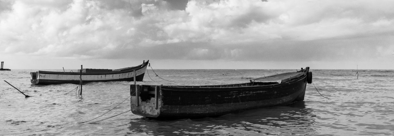
At any given period of my photography, you’ll probably notice a certain “type” of image popping up, so don’t be surprised by today’s monochrome. This was taken on the Georgetown Seawall towards the Kitty pump station, the building is Celina Atlantic Resort (I am not sure how the word resort got in the name, but its more a Restaurant and Bar)


After chatting with a few other photographers over time, I’ve concluded that it has to do with mood. Sometimes you are just in a b&w mood 🙂
Nik, I suspect you might be right, but there are two other reasons for me; the scene “says” BW or I process it that way because there is something annoying in the scene that can be masked using BW processing 🙂
I have really enjoyed your B&W, and this is no different! I find the clouds really captivating
Thanks David, there are some cloud formations that work especially well with a wide angle lens 🙂
Lovely photo Mike!
Thanks Sheila 🙂 always great to hear from you!
i love this one 🙂
Thanks Laura 🙂 really great to hear from you 🙂