On Wednesday last (June 2nd), my friend launched his Blog “Bad Light, Good Light” (http://badlightgoodlight.wordpress.com/2010/06/02/origin-of-a-name/) with a post regarding the origin of the name of his blog. It just happens that the image he used to illustrate the point he was making in the post was one from a walk we went on the day before, and on that walk I took what would become my photo for the 2010 Deck for this week, and it is of the same location as his, although I’ll admit his image had a lot more artistic merit. 🙂
.
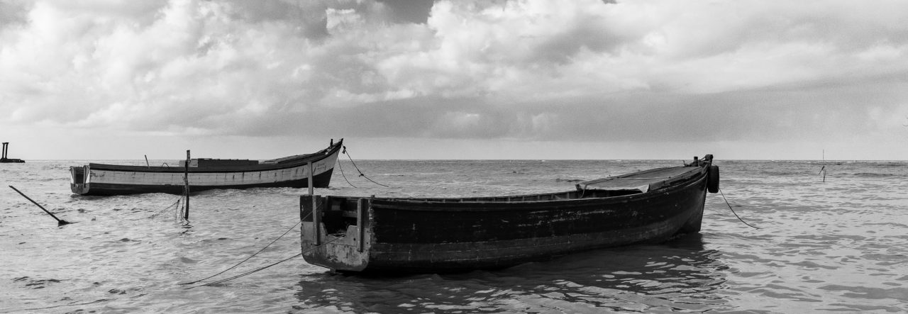
I’ve always been told “don’t shoot towards the sun”, and, by and large, this is usually good advice, but there are times when doing just that results in some nicely silhouetted images that have their own appeal. What I particularly liked about this scene was the portion of land to the right with the vegetation and the two boats anchored to the left, these made excellent silhouetted areas that contrasted nicely with the mostly clear sky, the low clouds were nicely “haloed” by the afternoon sun and that pretty much competed the scene for me.
.
I have always been an admirer of paintings by a local artist named V. C. Budhram, his renditions of water ans skies were always impressive, for that reason alone the ripples in the water reminds my of his work. His compositions, of course, were never like this, always more vibrant, full of life, and far more colourful.
.
This weeks entry for the Deck: Serene.
.


Well interpretations can clearly differ. I don’t agree that mine is more artistic. I think mine is more busy, and at the same time not as stylishly composed as this. I don’t do landscapes very well, and you do.
I think it is very useful for us to contrast styles and see our differing interpretations of various scenes. You seem to have had the same reaction to mine as I did to yours.
This is why I keep telling you, it is never a straightforward matter to look at our respective photos and assess which is “better”.
Nice photo Mike. I am sure it would not look as artistic in color. I have seen Nik’s “bad light” photo and both pictures are composed well to me. Every great photo needs structure and compostion and you and Nikhil take and share great photos.