Just a little ramble from me, this is not instructional in the literal sense. A fellow blogger and photographer, Nigel (or greysqrl) always asked me to write a tutorial on my monochromes and specifically my black and white photographs, but I’ve never felt that I had an “art” to it or a specific sequence of steps in the methodology to really do a tutorial type of blog, so I thought that at least I can do some rambling or musing on the subject.
Back when I shot with the Canon S5 Super-Zoom bridge camera (basically a hyped-up point-and-shoot) there were several colour modes including black and white and sepia, so I had disciplined myself to taking the scenes that appealed to me in these aspects in those modes, so I never had a full-coloured version of the photograph for any sort of comparison. So for me, the idea of a scene being in monochrome always started out before I pressed the shutter-button.
After I started using a DSLR (for now the Canon T1i or 500D) I learnt about post-processing further, using RAW images, etc. Now, I still consider many scenes in monochrome and earmark them for that specific type of processing later, but I also change my mind about some scenes that were not considered for monochrome initially.
What makes a good monochrome image? I really never thought about it, I just “feel” that some scenes make better monochromes than others. I am sure that as I continue my photographic journey I will learn more about what actually makes a good monochrome, to me it’s a “old” looking scene, or a scene with high contrasts, or in many of Nikhil’s cases one with lots of texture 🙂
How do I process a monochrome image? Since all my current images start out as full coloured, it is usually that “feel” that helps me select the ones for monochrome, either that or the new method of processing as colour and then it doesn’t quite come out the way I want and I send it over to monochrome just to see what would happen 🙂
I use Lightroom as my primary image processing and workflow application, but the majority of my monochromes are done in Nik Silver Efex (after some processing in Lightroom). I take each photo on its own merit, some need to be treated softly while others need to be more contrasty and structured. Nik Silver Efex has a range of presets that you can view easily and then do your own fine-tuning.
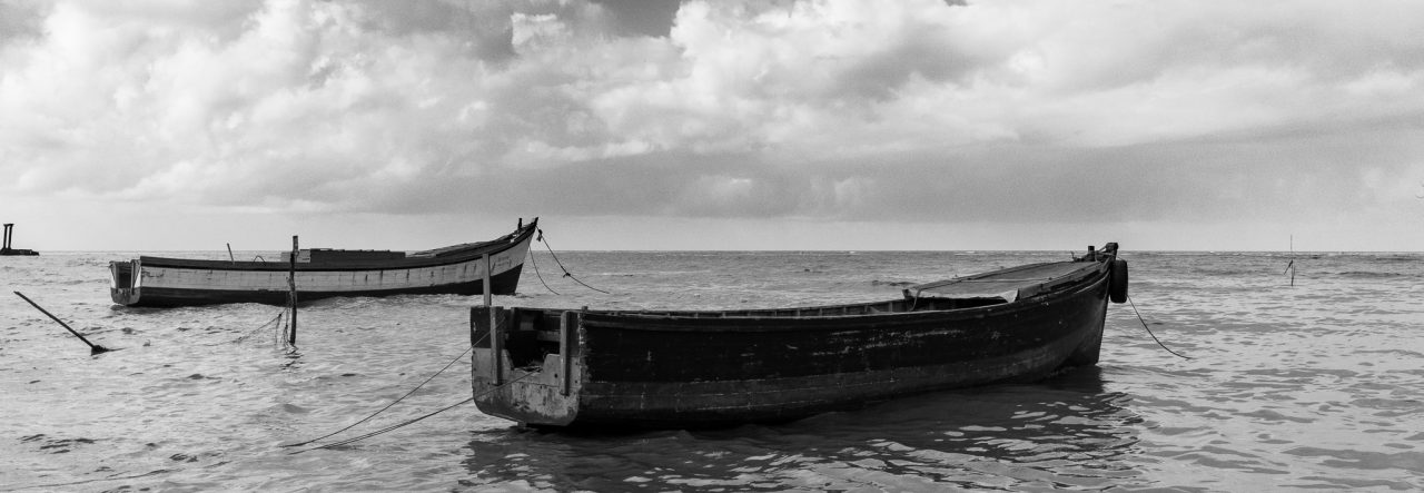
With scenes that have clouds (I seem to have many of those now) I always go for bringing out or enhancing the detail in the clouds. The dynamic range captured using a single exposure is not (always) a true representation of what the human eyes saw or can see. Often I would look at the scene and see the nice detail in the foreground, then look up and see the layering in the clouds, but when the photograph is taken I lose some detail, and In post=processing I try to retain that detail that I saw.

This particular photo was not intended as a monochrome image, the upper portion of the boat (or lower portion in the image, since the boat is upside down) was yellow and I had initially intended to emphasize that, but it didn’t work out as planned.

I thought the boat was a wall. Very good work. Love the skies. almost look as if the clouds are coming out of the center.
Thanks Aunt Rose, I deliberately took it from a low vantage point 🙂 strange enough I hadn’t noticed the clouds being whiter behind the koker until I had started processing.
I like your version of rambling 🙂 Nice post, enjoyed reading it.
Thanks 🙂 I guess my ramblings make some sense after all then 🙂
I think you have a great natural feel for monochrome. It’s not something I am able to achieve with any success at all! I appreciate reading about your process. Thank you.
Thanks Cindy, it took me some time to get into monochrome…