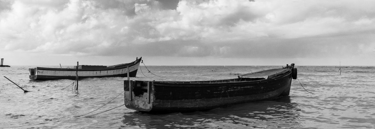
I had a few images that I rendered in monochrome this month, these were the results of three walks I did with Nikhil, I got a few nice coloured images, but more that I processed in monochrome, which is unusual for me. I have a few friends who always love my monochromatic work, so I think that they will like these images 🙂
I know that the title “monochromes” cover more than just black & white and sepia images, but I have not quite gotten around to expressing myself in the other formats as yet, although some of my black & white images are actually more of a selenium tone rather than pure black & white. I tend to lean towards the idea that if it is close to black & white, then that’s where I will categorize it, even if it does have a slight tinge of another colour. If the effect is more obvious, then I will rethink its category.
To start it off I have two Sepia images, one from the shore at the Kingston Promenade seawall and the second from the Manatee Pond at the Botanical Gardens, Georgetown.


And now for the Black and Whites, I have four new added to the album; and they go like this:


I have found a fondness for monochromatic images, now all I have to do is learn how to represent them better and better, each time I try one I find something new, sometimes I want lots of detail and other times I want high contrast with starkness, sometime I want a bit of both. Hopefully I am learning all the time 🙂

I just call ’em all “monotone” 🙂 Although in several images recently I have done different tones in the highlights and shadows, I wonder if I can call those “duotones” 🙂
Anyway, nice collection, forget the symantics.
Actually you are right, when using two different colours in highlights and shadows they are duotones 🙂 I haven’t tried those as yet 🙂
Fantastic detail and wonderful rich tones in these. The monochrome (or whatever you want to call it :)) really brings out the lines and shapes, and contrasting tones. I’m trying to pick a favourite and I’m torn between the gorgeous sparkling sand in the first one and the dramatic composition in the last. Great set!
Thanks Cindy,
as you noticed, the sparkling sand in the first is what drew my attention to that one, and the last image was just one of those moments… the people stepped onto the wall and I knew I had to take the shot.
I’m a big fan of monochrome. It has a really nice feel in general. Clouds over the bandstand is excellent!
Thanks, I wasn’t 100% happy with that one, the lower portion needs something (don’t know what) 🙂 but I like it in the ninety something percent area 🙂
Lovely collection. Especially the last 2 pics. The silhouettes caught sharing a moment. Nice 🙂
Thanks, getting silhouettes that “speak” in a photograph is always a little tough, so when I get them I am always pleased 🙂
Beautiful, I’ve always liked this type of photography. Love the second to last one.
Thanks Jaclyn,
it seems black and whites and sepias are favoured by lots of people 🙂
I absolutely love your “Clouds Over the Bandstand”. Fantastic!
Bob Zeller
Bob, coming from you, that’s a real compliment, I have a real high regard for your work!!!!