2014 Deck – Week 40

It is not often that I am at the seawalls when the tide is at its highest and the waves are crashing against the sea defences, when that does happen, I usually take some photos, but seldom use any; mainly because I never seem to get one that I think stands out enough.

I think I may have gotten one that passed muster this last occasion 🙂


Crashing Waves – Georgetown Seashore


On this one I did some unusual processing (for me), I “cooled” the lower area with the rocks prior to applying the red filter, without that the details in the rocks were getting lost 🙂


2014 Deck – Week 38

This photo was included as part of my extended Oniabo collection  which I presented at Moray House in a slide-show presentation in October.

The Oniabo collection started as a collection of 6 images, but when I was offered the opportunity to present something at Moray House, I revisited the idea and extended the collection to 16 Images.

I now have a better grasp of the collection and what I want it to be, and by early next year I hope to have concluded the set, omitting some that are there now and including others that are still in the making 🙂

Compositionally I was going for the three layers that I saw; the cloudy sky beyond the horizon, the mud-flats and the receded sea, and the rocky foreground,  it was fairly dark already, but I knew that the some-what even lighting would make a good shot.  A couple being there helped to make this shot even better.


“couple”  –  Lusignan, East Coast Demerara


Click on the image to see it in the Gallery, also the visit the Oniabo collection as presented at Moray House.


2014 Deck – Week 14

I am scheduled to do a presentation of some of my select works on October 9th at Moray House (part of the Moray House Trust’s foray into encouraging local photographer to express their vision of their art), and I am very nervous about the whole thing, I am not sure what to say.

I often don’t mind sharing my work, but to talk about it makes me feel queasy; I’m usually afraid I’ll either come off as not knowing what it is I’m talking about, or as being pretentious, trying to pass off what I do as “art”…

But, I’ve committed to it and I’ll either make a complete mess of the whole thing or come out the other end, not much worse for wear 🙂

The title I chose for my Seascape collection is “Oniabo”, an Arawak word meaning water, I’ve decided to use an extended version of this title for this presentation at Moray House, which will include most or all of the 6 photos in the Oniabo series as well as other images at the seawall.

That being said, the photo I offer for this week was one under consideration to be part of that presentation, but was subsequently side-lined.  Although it in no way resembles Hiroshi Sugimoto’s work, it reminded me that Sugimoto’s Seascapes collection is the reason I had decided to begin a Seascape project in the first place,

Sugimoto begins his description of his series like this:

Water and air. So very commonplace are these substances, they hardly attract attention―and yet they vouchsafe our very existence.

My seascapes invariably often include some “land” or earth (a third element?), but this one I titled “Born of Air and Water” as a reminder to myself of Sugimoto’s words.


Canon EOS 60D  |  Sigma 10-20mm  |  10mm, f/4.0, ISO100


Click on the image to see it in the Gallery along with other images from this year’s Deck Project

Colour or Monochrome

When film (or plate) was the way to capture photographs, there were many many debates, just like there are now.  They didn’t debate sensor sizes, they debated film sizes (and that had so many I won’t even start on that), and just like many enthusiasts and professionals now debate colour vs monochrome, so it also went back then.

While there were specific films developed for both types back then, in the digital age we are pretty much guaranteed that the camera you buy, whether the one in your mobile phone, compact camera, mirrorless or DSLR camera, it will in all likelihood take the photos in colour, which you can then convert to monochrome (black and white, sepia, etc) in post-process, whether in-camera or in software on the PC.  This changed when Leica developed their Leica M Monochrom, it was the first major brand to produce a high-end digital camera that produced only black and white photographs, and rumor has it Sony is working on a black and white version of their RX 1.  I don’t want to get into a debate myself over the need or desire to have a camera that only shoots monochrome, I can only say that it is unlikely I would ever buy one myself, but that is probably only my wallet talking.

In the genre of Street Photography, there is usually a preference for black and white images, but there are many many great coloured Street Photographs out there, more than you’d think.  Henri Cartier-Bresson’s work in street photography was very definitive for the genre, and all his work was in black and white, he also experimented with coloured film but was never satisfied with the results; of course, he only had access to the types of film available then (the 1950s) and if you look back at coloured prints from those days you’d see the limitations of the coloured film of the time.  I dare say that if he had lived in a later era, he may have at least given the coloured films a chance.

When I first started taking photographs on a slightly more serious basis than just snapshots, I didn’t do much black and white processing, and even when I did, it was more for the novelty than because I knew why it should be done and to which photographs.  Now I do a lot more processing in black and white…

What have I learnt that changed my views?

I’ve learnt that not all photos look good in monochrome, the tonal range and subject matter is very important for an image to look good in monochrome.  Monochrome images tend to showcase textures, shapes and form better, and by removing colour from the image you are left with just the elements that make up the composition, and if those elements are not functioning correctly in the overall composition, it will feel off, or look cluttered.

When used correctly, colour will catch the eye and hold it, this works for some compositions, but for others, that same thing tends to shift the focus of the viewer from the overall composition and have them concentrate almost solely on one portion of the image.

I’m no expert, but this is how I see it; recently I took a few photographs of some Jhandi flags on the Kingston seashore, and I chose two that I liked, and I processed them quite differently, and primarily for the reasons stated above.

This one I chose colour, because the main subject and the focus of the image is the Jhandi flags themselves, the various colours chosen as they contrast with each other, the browns of the sand and the blues of the sky.

The second image I processed in black and white to articulate the relationship between the clouds in the sky with the sands on the ground, the change from dark to light in both the sky and the land as they meet at the horizon, the sharpness of the shadow from the midday sun, and the contrast between the flags on the pole so close to the viewer against what seems to be a smaller post in the distance to the left of the frame.

These are my decisions, they may quite well not be anyone else’s choice.


In the end, these are choices I make in how I express myself artistically now, it is not how I did it a few years ago, it may not be how I do it five years from now.

Click on the images to see them in their respective galleries.

2013 Deck – Week 25

This week, I’m adding a new image not only to the Deck Project but to my slowly growing (as yet untitled) Seascape project.

It may be more a combination of landscape and seascape, you can see the road and the seawall, but I still consider it part of the Seascape set 🙂


Canon EOS 60D  |  Sigma 10-20mm  |  10mm, ISO100 | Red filter in Post-process


Click on the image above to see it in the Gallery.


The Driftwood.

Have you seen the driftwood that climbs the rocks,
and basks in the midday sun?
The one that crossed two oceans and a sea,
Yes, that’s the one.

It was cast adrift by a little boy
who threw it from the shore
To see if it would then return
back to him once more

He watched it bob among the waves
until it was lost from sight,
Then away he ran to play among
the children of the night

Upon many beaches it took a rest,
then washed to sea again
until it touched upon our shore
and bathed in sun and rain

I doubt that you will find it now
for I passed a hobo this morning
And I thought I smelled some fish broth
and the scent of driftwood burning.


Elemental


The clouds, they roll toward distant shores,
O’er seas and lakes, past engines and oars,
horizons mean nought, but a curve of land
that changes but slight, by nature or man

The sun shines on, through fog or haze,
O’er stormy skies, or clear summer days
It beats upon the land beneath
or upon the clouds, spread like a sheet

The sands, they move with the ocean’s might,
on ebb tide or flood tide, all day and night
valleys are made, with wondrous ease
and disappear as quickly as a deity’s sneeze.


Click on the image to see it in the Gallery along with others in my Black and White album

Photograph and Poem copyright to Michael C. Lam, all rights reserved.

2013 Deck – Week 20

I was processing this image as a part of another long-term project that I’ve been doing; Seascapes, but I decided that I would also include it into the Deck Project as it turned out so nicely 🙂

The water was lapping around the larger rock seen here, the tide was on it’s way out, and the sand/mud could be seen at the rock’s base when the wave had receded.  The waves seemed fairly predictable, coming in, swirling past the rock and then receding, so I set my self and waited for it, when it came in, it came a little harder and faster, and I involuntarily jerked backwards a bit and the shot actually came out at a bit of an angle, so I had to crop back to straighten the horizon.  I did have others that I could have used, but this one came out nicely, in terms of composition and the way the water was.

The skies were just how I like them recently, fairly dramatic, nice variations and with a fair amount of detail that I knew I could eke out of the RAW file.


Canon EOS 60D  |  Sigma 10-20mm  |  1/500s, f/14, 10mm  |  Rotational crop


Click on the image to see it in the Gallery

2013 Deck – Week 10

My priorities in life must most definitely be askew, since I seem to have less time for photography than ever before…  But even if I have to take a photo of the same thing every week, I will finish this project  🙂

As I was driving along the seawall, I noticed the white-capped waves as they rushed to shore and thought to just stop and catch a few.  It was a bright afternoon, but lacking any fancy filters or gadgetry I thought that I’d just bring out the focus of my intent in post-processing.

I used an orange filter in Post-processing to deepen the hue of the sky and emphasize the white caps of the waves.


Click on the image to see it in the Gallery.

Pro – defining and refining

Twice in recent times, I’ve been accused of being a “Pro”, as in a Professional Photographer, and both times I’ve been taken aback by it.  Me? a Pro?  Surely they don’t think so!

The first time was on a public discussion on the Guyana Tourism Authority’s Facebook page where we were discussing their Photography Competition, the unfairness of one of the “rules” and the general direction of the competition, the individual calling me a Pro thought that because I was a known name in Photography in Guyana I should not be questioning the rules of the competition (open only to amateur photographers), and stay out of it.  I humbly submit that I am not a known name… stop ten people on the street and ask them if they know Michael Lam, and they’ll all probably ask “Who?”  In the small, but growing, Photography world locally, yes, my name is known alongside those of Nikhil Ramkarran, Dwayne Hackett, Fidal Bassier, Ryan Dos Santos, Amanda Richards, Roshanna Mahadeo, Compton Sarabo, Vishnu Persaud, Philip Williams, Avinash Richard and countless others (sorry if I missed anyone).

The second time was in a newspaper article that covered the recently concluded Guyana Visual Arts Competition and Exhibition, in which I gained the Bronze Medal in the Photography category, the reporter referred to me as “Pro photographer Michael Lam”, again I felt that it was a distinction I could not accept or live up to.

Who is a Professional?  Generally you need to meet certain criteria to be a Professional:

“Expert and specialized knowledge in field which one is practicing professionally” I don’t possess that knowledge, certainly not to a degree to be teaching it or express an “expert” opinion on it, so that one is out.

“Excellent manual/practical and literary skills in relation to profession”, same as the first, not me!

“High quality work in Photography”, OK, if it’s good enough for the National Art Gallery at Castellani House to exhibit, then I suppose I have to acquiesce to this one

“A professional is an expert who is a master in a specific field”, definitely not me, oh no!

Let’s get specific to a Professional Photographer:  A professional photographer uses photography to earn money; amateur photographers take photographs for pleasure and to record an event, emotion, place, or person.  I have a day job, I’ve always described myself as a Photo-hobbyist, and I still see myself that way.  Photography isn’t my primary income, if it were I’d be starving.  Have I made money off of photography?  No, I spent more than I made.   I’ve been fortunate to have some of my images licensed for use in a few calendars, I’ve also had a few images sold for display, does this make me a Professional?  Simply because I’ve had some income from my hobby?

I have to admit, that this view was the one I had originally taken of Professional Photographers, those who have sold their services or products, so now I fall into that category, but I still can’t see myself as a Professional.

I look at Robert (Bobby) Fernandes, whose years of experience and his natural Photographer’s Eye, can capture a scene with a certain “Je ne sais quoi” that tells you its a great photo, and I think that’s a Professional!

I look at Delano Williams, who has been doing portrait and wedding photography in Guyana for many years, and I think that’s a Professional!

I remember Mark Yhap, who took portrait photos on Camp Street, he used SLR film cameras and light meters, and had everyone wanting their photos looking ethereal because of a “soft lens” that he used, and I think that’s a Professional!

I look at Dwayne Hackett, one of the only trained photographers that I know of, who does spectacular work for everyone from Corporations down to studio portraits, and I think that’s a Professional!  He knows more about lighting, depth of field, and most everything else, than I ever will.

I look at Fidal Bassier, who has taken wedding photography and portrait photography to a level Guyana has not seen before, and I think that’s a Professional!

I look at John Greene, who in a short space of time has carved out for himself a space in the Portrait photography world and is steadily expanding his repertoire, and I think that’s a Professional!  I certainly don’t have that business sense or attitude.

I look at my friend Nikhil Ramkarran, Gold Medal winner in the Photography Category of the Guyana Visual Arts Competition and Exhibition, whom I always thought “never had an artistic bone in his body”, but who read and looked at every single thing he could find about Photography and Photographers, and tutored himself (and me along the way) in the art of photography, and I think to myself that’s a Professional!  You could ask him almost anything on the subject, and you’ll not only get expert knowledge, but an expert opinion.

Do I rank with these people, or with so many others in the field now?  I am not sure, I’m happy to call them my peers, my fellow Photographers, and I am proud to be among the talented people of The Guyana Photographers.  Can you book my time for a portrait shoot? No.  Can you book my time for a wedding shoot? No. Will I ever do that?  I don’t know, it’s just not my thing right now, and I have a day job  🙂

Why do people think I am a professional?  I don’t know and it really does not matter in the long run.  I know a few things about photography, and I’m willing to share what I know, and learn from others in the process, but in the end, I merely shoot what I see, and sometimes people like what I shoot.


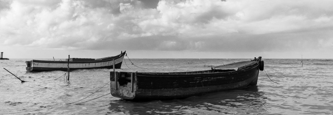
To the Photographs in this post…. both photos were taken during the first week of the year, and both were shortlisted along with two others for the first photo for the Deck Project, but I chose another, just because I felt like it.  The ;little icon of the Newspaper is the article which I mentioned, clicking on it will give you the full PDF version from the Newspaper’s website (Sunday Times Magazine).

Both of the photos are technically composites, that is they are High Dynamic Range (HDR) images each using three exposures.  Of the two, the seascape that I titles “The Lonely Sea” is my favourite.  HDRs are one of my favourite photographic techniques, but as with all techniques it can be misused.  Click on the images for a better view in the Gallery, along with other HDR images in my Scenic Experiments Gallery on my site.


Definitions highlighted in bold taken from Wikipedia.org

Water

Sometimes using a “rule” works in your favour.  One of the most harped-upon rules of photography is the Rule of Thirds, I think every beginner in the field knows this one.  Divide the viewfinder in three parts, both vertically and horizontally, then use that to help compose the image, whether putting subjects into the portions or onto the dividing lines.

Nikhil always tells me that we should know the rules, so we’ll know when to break them with greater effect on the resulting image, or in this case use it as literally as possible  🙂

I tried my hand at another seascape, and remembered that sometime back I was told that more than two-thirds of the earth’s surface is covered by water, so I covered two-thirds of my image with the sea-water  🙂

Click on the image for a better view in the Gallery.