I must have been too busy this week, or maybe the short week caught me off-guard, but it seems I forgot all about the Deck photograph until today 🙂 So, with just a little preamble I present this week’s photograph for the 2010 Deck.
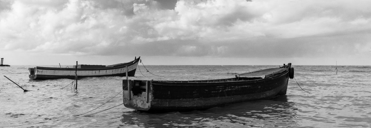
At any rate, I actually did take a few photographs this week, so I just had to choose one, right? I wish it were that easy. But, after scanning through the ones I had taken this week, I chose one that may not be my favourite, but I think is a nice dramatic photograph with lots of character, I seem to be looking more and more into buildings with character recently, and as for these “old buildings” I blame Nikhil, he has a fascination for old and derelict buildings that has rubbed off on me somehow. Incidentally, this one was taken on one of our afternoon walks.
Just a note on the processing. More and more people are asking me what “editing” I do to the photographs, and I don’t want to go into that old argument right now, Nikhil has a nice blog on that in Editing a Photograph.
The processing I did to this one was done in three steps, firstly, I did some chromatic aberration adjustment (correcting what is known to many photographers as purple fringing in the high contrast areas), then I did some “spot removal” of a pair of wires in the upper right hand corner, then applied a Lightroom preset called “Color Creative – Aged Photo”. There you go, a step by step of the creation of this week’s Deck Photo, but don’t expect me to do this every week. 🙂


That was interesting Mike. Some photos do cry out to be explained and that was nicely done. Thanks for the pingback by the way.