2014 Deck – Week 06

The day this photo was taken did not turn out to be a happy day, so you’ll excuse me if the post seems depressing… even morbid.

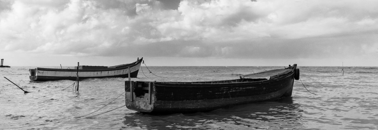
That being said, I do believe that the photo was chosen not based on that but on it’s own merits.  I rather liked how this one came out.  I was using my Sigma 17-50mm, mostly to take photos of the scenery (not much of it that day) and some snapshots of my daughter.  I was pleased that this came out as good as it did, considering that most times I would have tried this with my ultra-wide Sigma 10-20mm.

The reason the day was a bad one is that shortly after taking these photos, I returned to my vehicle to realise that someone had gotten into it and stolen my bags, which included my laptop computer, and all my camera gear barring the camera and lens in my hand, the Sigma 10-20mm which a friend had borrowed, and the tripod which they left on the floor of the car.

Sadly, the police have neither found nor recovered any of the items (and have no idea who might have done it)

Now onto the photo…  and you can ignore the poem that follows 🙂


Canon EOS 60D | Sigma 17-50mm  |  1/320s at f/6.3, ISO 100, 50mm

Click on the Image to see it in the Gallery


Caught in the nets,
prisoners from the deep
dragged into the air,
I’d cry, but fish don’t weep…

Tossed into a boat,
tormented by the sun
gasping for breath
the boat; shorewards run…

Sorted by calloused hands,
most onto the ice,
I upon the ground;
apparently I’m not nice…

Upon the hard ground,
I flounder, I try…
On land, beneath the sun
I dry, I die.


For those curious people who will ask 🙂  Here’s a shortlist of some of the Camera related gear that was stolen:

1 LowePro Backpack Camera Bag
1 Canon Speedlite 580EX II Flash
Serial Number: 611144
1 Canon EOS Rebel T1i Camera
Serial number: 0370111906
1 Tamron Di II 18-270mm Lens
Serial Number: 096584
1 Tamron AF 18-270mm Lens
Serial Number: 061042
1 Canon EF50mm f/1.8 II Lens
Lens No: 2514A003[BA]
1 Canon EF40mm f/2.8 STM Lens
Lens No: 6310B002[AA]
1 Canon EF-S 18-55mm f/3.5-5.6 IS Lens
1 Canon EF-S 18-135mm f/3.5-5.6 IS Lens

The list is very long, but most of the rest is camera related accessories and paraphernalia, oh, and my Kindle Fire which I really really miss… I hadn’t realized how much I read until it was gone.

2013 Deck – Week 44

In recent years I’ve taken less and less Diwali photographs, probably because I choose to spend the time with my family, and seeing as we’re not Hindus, we don’t usually light up Diyas, and the area I spend the time in is not usually very well-lit.  This year was not very different, with the exception that in-laws decided to light a few Diyas, especially for the children to experience it, so I got a few photos of Diyas 🙂

As soon as I had taken this one, I knew that it would be my choice for the Deck Project, it just had the right feel for me, some people think it is simple and don’t see in it what I see, but that’s the thing about photos, every person has their own reaction, so I never usually expect people to love the ones I do.

Here’s my offering from Diwali.


Canon 60D, Canon 40mm Lens |  1/60s, f /2.8,  ISO 1600


Click on the image to see it in the Gallery

Hermes

Hermes – God in the Greek Pantheon, often associated with speed and cunning, the messenger of the Gods.

I took of photo of an old Hermes typewriter whilst on a short walk down Main Street, I mainly took it because it made me remember how I first learned to type, on a Hermes typewriter, just like that one, but in better condition 🙂

At the time I didn’t like the resulting photo and just left it there in my catalogue, but on looking through some of my older stuff, I came across it again and decided to try processing it, after deciding on using a sepiatone process, I still wasn’t entirely happy, then I realized what was bothering me, it was the buildings in the background that showed in the upper portion of the photo, after judiciously cropping that out I was left with an image that I was more pleased with  🙂

Sometimes speed and efficiency can let images that are good slip away, simply because what needed to be done was to let the pixels age, and your outlook on the image mature.

Click on the Image for a better view in the Gallery, along with other Sepia-toned images in the collection.

2012 Deck – Week 31

After all that scenery and strange sights of Jamaica and Barbados, you would think that I would come back to Guyana with an eye for more landscapes and such, but my first morning back and I see a photo opportunity that was perfect for Nikhil, but since he wasn’t around I thought I’d give it a shot, I’m not very good at lining up my images in the eyepiece, something to do with my eyesight and spectacles, but after some attempts and a bit of correction in post-process I think I got a decent shot out of it.

While we were away, this weed decided to grow up through the grill over the hole in our bridge, tiny aquatic plant-life covered the water, and the morning sun helped to cast nice shadows to bring some dimension to it all  🙂

As always, click on the image for a better view in the Gallery

Old(er)

Age is a relative thing, something (or someone) is either younger (or newer) or older than another by a certain amount of time, whether it is by minutes, days, years, decades, centuries, etc.

I’ve grown up knowing the Hand-in-Hand Insurance Building (and others of its time) and they’ve become landmarks to me, that makes them old, or older than the stuff that went up in the last decade anyway.

They may not be of the Victorian era, so their architectural aesthetics may be less appealing, but they are certainly a lot more appealing than many of the concrete boxes that are being erected these days.

The Hand-in-Hand building always reminded me of a concrete and stone attempt to look Victorian, or maybe semi-Greco-Roman, but I’m not an architect and my terms may be far off the mark.

I had always admired its arches, the wrought-iron fence, the wrought-iron “fret-work” that created the arches between the columns, the low-sprawling style of the building.

When I took this photo I never intended to process it in Sepia tone, yet that is what appealed to me when I began processing, and to help the age along a bit, I added a light vignette (hopefully not too noticeable)

So this building is Newer than Victorian, but probably older than I am 🙂

Hand-in-Hand – 7216

2012 Deck – Week 11

I try not to do single image HDRs, that is, using a single exposure and tone-mapping it for greater detail throughout the scene, but sometimes I can never quite seem to get the processing on an image quite right in colour, and sometimes its an image that I would prefer not to use as a monochrome, so then I tone-map it in an HDR software to bring out that detail that I know is there.

This photo is of the Moravian Church in Queenstown, Guyana.  It is more than a hundred years old.

It stands at the junction of Anira Street and New Garden Street, and there are utility posts and wires on two sides of it, I composed this to minimise the effect of those wires.

Queenstown Moravian Church

First Shot

When I got my hands on the first DSLR that I could say was “mine to use”, you know; not borrowed for a short time, I decided that I wanted the first exposure (or the first frame) to count, to mean something, or at the very least, to be a special photo 🙂

I had just gotten my hands on the Canon Digital Rebel T1i (500D), and I had not too recently been viewing some photos by Dwayne Hackett, and there was one that had inspired me, it was of St. George’s Cathedral, and I decided that I wanted that to be my first shot.  As it turned out, even though I tried to time it right, a vehicle sped into the frame just as I clicked, so the second actuation was my photo instead.

I have now gotten my hands on an upgrade, so I thought I’d do the same thing, try for a special photograph.  Week after week I pass the St Philips’ Green and think about how I would photograph the Church there (under renovation), but I am usually afraid to stop because of the type of desolate area it is.  They had just finished clearing the area close to the road and the Church was quite visible from the road across the cleared land, and the branches from the trees helped to frame it nicely, so that was to be my first actuation on the Canon 60D.

St. Philips' Church

2012 Deck – Week 2

This week’s photo is not a great one or even a good one in my opinion, but as I began writing this post, some news was delivered to me and the photo somehow seemed… appropriate.

Revealed in shadow

Recently my friend (if she permits me to call her that) Reshi, wrote a post titled “Colour me Pretty”, and it had me thinking about many things, one was the effect of darker colours on a photo, the effect of shadows and light in photographs as Nikhil so masterly does them, and about the duality of emotions, and the different faces that we show people.

This post is dedicated to Godfrey Chin, many or most Guyanese will know him as the prolific writer of his “Nostalgias”, he numbered them.  I came to know Godfrey only in recent years, and he has made an impact on me.  He did so much in his life that I think someone will have to write a Nostalgia about him.  I don’t know enough to do that to any degree of adequacy.

I know of his costumes and “floats” for the Mashramani Celebrations during his more youthful days, and I saw a bit of his style when he did some decorating for a party, and as I explained to someone, it was all about the look, it was a façade just to give the impression of the intent and not to be something that lasts forever, just for that party for those moments, yet his “Nostalgias” were vastly different, trying to scour the depths of his memories of his times in Guyana and write them down for others to share and reminisce, trying to capture those, maybe not for eternity, but at least that they live on for some time more.

Godfrey Chin was found this morning  at his home in Guyana, he died sometime this weekend.  Stabroek News called him a “Social History Icon” and a “Culture Enthusiast”, both descriptions are possibly very accurate, but I can attest to the second one better.

Why did I think that this photo was somehow appropriate for him?  like the pointer-broom in the photo, Godfrey would sweep up and tidy up his memories and give us the sparkling finished product as a “Nostalgia”, like the light and shadows, he would help to reveal aspects of the past hidden to one or the other; if it is too bright you can’t see clearly, nor if it is too dark can you see at all.

Godfrey had asked me to give him some photos for an exhibition he was to do this Mashramani, they are on my desk, but now he will never see them, he was a fan of my work, maybe because we both thought of ourselves as family, I am thankful for his encouragement.

Godfrey came into our office during the Christmas Season and made his rounds, had a few “gaffs” and before he left, dived into his bag, took out some gold tinsel and proceeded to further decorate our Christmas Tree.

For Godfrey Chin, may his soul rest in peace, and if Heaven has a Parade we know what he’ll be doing.  In Godfrey’s words “Ya think it easy?”

Working with Monochrome

Just a little ramble from me, this is not instructional in the literal sense.  A fellow blogger and photographer, Nigel (or greysqrl) always asked me to write a tutorial on my monochromes and specifically my black and white photographs, but I’ve never felt that I had an “art” to it or a specific sequence of steps in the methodology to really do a tutorial type of blog, so I thought that at least I can do some rambling or musing on the subject.

Back when I shot with the Canon S5 Super-Zoom bridge camera (basically a hyped-up point-and-shoot) there were several colour modes including black and white and sepia, so I had disciplined myself to taking the scenes that appealed to me in these aspects in those modes, so I never had a full-coloured version of the photograph for any sort of comparison.  So for me, the idea of a scene being in monochrome always started out before I pressed the shutter-button.

After I started using a DSLR (for now the Canon T1i or 500D) I learnt about post-processing further, using RAW images, etc.  Now, I still consider many scenes in monochrome and earmark them for that specific type of processing later, but I also change my mind about some scenes that were not considered for monochrome initially.

What makes a good monochrome image?  I really never thought about it, I just “feel” that some scenes make better monochromes than others.  I am sure that as I continue my photographic journey I will learn more about what actually makes a good monochrome, to me it’s a “old” looking scene, or a scene with high contrasts, or in many of Nikhil’s cases one with lots of texture 🙂

How do I process a monochrome image?  Since all my current images start out as full coloured, it is usually that “feel” that helps me select the ones for monochrome, either that or the new method of processing as colour and then it doesn’t quite come out the way I want and I send it over to monochrome just to see what would happen 🙂

I use Lightroom as my primary image processing and workflow application, but the majority of my monochromes are done in Nik Silver Efex (after some processing in Lightroom).  I take each photo on its own merit, some need to be treated softly while others need to be more contrasty and structured.  Nik Silver Efex has a range of presets that you can view easily and then do your own fine-tuning.

With scenes that have clouds (I seem to have many of those now) I always go for bringing out or enhancing the detail in the clouds.  The dynamic range captured using a single exposure is not (always) a true representation of what the human eyes saw or can see.  Often I would look at the scene and see the nice detail in the foreground, then look up and see the layering in the clouds, but when the photograph is taken I lose some detail, and In post=processing I try to retain that detail that I saw.

Dry Docked?

This particular photo was not intended as a monochrome image, the upper portion of the boat (or lower portion in the image, since the boat is upside down) was yellow and I had initially intended to emphasize that, but it didn’t work out as planned.

2011 Deck – Week 32

Another symmetry inspired image, or a Nikhil inspired image 🙂  I’ve seen Nikhil shoot this particular spot a few times already, but I never tried it, mainly because I wasn’t “seeing” anything that captured me, this week was a slow week, I only got out one day to take anything, and this day I forced myself to shoot something, if not I’d have had to post an image from a recent wedding I attended, and I didn’t want to have to rely on that 🙂

This is the side of the Ocean View Hotel facing the seawall, the salt air can be seen taking it’s toll on the iron-work, and the rust staining the face of the wall.  This particular afternoon I was going for something simple, I tried a boat, some silhouettes, just the plain old sea and sky, but I kept going back to this image for a second look.  Although I was tempted to go for a monochromatic image I liked the red iron structure and the rust-stains, so I kept it in colour. also the discolouration on the walls added to the warm afternoon sunlight 🙂

As usual, click on the image for a better view in the Gallery.

Escape
Escape