Tower

Back when it was still called Hotel Tower.

There has been a Hotel with the word “Tower” in its name on this spot for more than a century.  I can’t find enough online historical evidence, but before the current name “Tower Suites”, it was the Hotel Tower for many years, and prior to that it was the Tower Hotel.  I saw an 1909 Ad that claimed that “The Tower is the oldest and Best Hostelry on the Northern Coast of South America”.  🙂

Hotel Tower  |  2009  |  Canon EOS Rebel T1i, Sigma 10-20mm


Click on the image to see it in the Gallery.


Presbytery

Not much of a blog post really, just a few photos of the old Presbytery building of the Cathedral of the Immaculate Conception, Georgetown, Guyana.

I think they began tearing it down this year (or it may have been last year, I don’t recall exactly), just the small portion to the back remains now.


Click on the images to see them in the Gallery.


2014 Deck – Week 47

I don’t often do these types of shoots, but when I do I usually have fun, it allows me some experimentation and I get to be in a place that few would have seen before…  A new Bar.

My friend Diane asked me to take a few photos of a new Bar that she was going to run, well, sorta new, it was originally located at the Cheddi Jagan International Airport, but has now been relocated to the Midtown Hotel, it’s Friendly’s Bar, and it’s pretty cool.

The nice thing was that she and Larry did not want people in the shots at this time (hopefully I get to go back to do some with people), so I got to be as free with my shots as I liked (and a couple free drinks)


Friend;y’s Bar, Midtown Hotel, Georgetown, Guyana.


Click on the image to see it in the Gallery.

Colour or Monochrome

When film (or plate) was the way to capture photographs, there were many many debates, just like there are now.  They didn’t debate sensor sizes, they debated film sizes (and that had so many I won’t even start on that), and just like many enthusiasts and professionals now debate colour vs monochrome, so it also went back then.

While there were specific films developed for both types back then, in the digital age we are pretty much guaranteed that the camera you buy, whether the one in your mobile phone, compact camera, mirrorless or DSLR camera, it will in all likelihood take the photos in colour, which you can then convert to monochrome (black and white, sepia, etc) in post-process, whether in-camera or in software on the PC.  This changed when Leica developed their Leica M Monochrom, it was the first major brand to produce a high-end digital camera that produced only black and white photographs, and rumor has it Sony is working on a black and white version of their RX 1.  I don’t want to get into a debate myself over the need or desire to have a camera that only shoots monochrome, I can only say that it is unlikely I would ever buy one myself, but that is probably only my wallet talking.

In the genre of Street Photography, there is usually a preference for black and white images, but there are many many great coloured Street Photographs out there, more than you’d think.  Henri Cartier-Bresson’s work in street photography was very definitive for the genre, and all his work was in black and white, he also experimented with coloured film but was never satisfied with the results; of course, he only had access to the types of film available then (the 1950s) and if you look back at coloured prints from those days you’d see the limitations of the coloured film of the time.  I dare say that if he had lived in a later era, he may have at least given the coloured films a chance.

When I first started taking photographs on a slightly more serious basis than just snapshots, I didn’t do much black and white processing, and even when I did, it was more for the novelty than because I knew why it should be done and to which photographs.  Now I do a lot more processing in black and white…

What have I learnt that changed my views?

I’ve learnt that not all photos look good in monochrome, the tonal range and subject matter is very important for an image to look good in monochrome.  Monochrome images tend to showcase textures, shapes and form better, and by removing colour from the image you are left with just the elements that make up the composition, and if those elements are not functioning correctly in the overall composition, it will feel off, or look cluttered.

When used correctly, colour will catch the eye and hold it, this works for some compositions, but for others, that same thing tends to shift the focus of the viewer from the overall composition and have them concentrate almost solely on one portion of the image.

I’m no expert, but this is how I see it; recently I took a few photographs of some Jhandi flags on the Kingston seashore, and I chose two that I liked, and I processed them quite differently, and primarily for the reasons stated above.

This one I chose colour, because the main subject and the focus of the image is the Jhandi flags themselves, the various colours chosen as they contrast with each other, the browns of the sand and the blues of the sky.

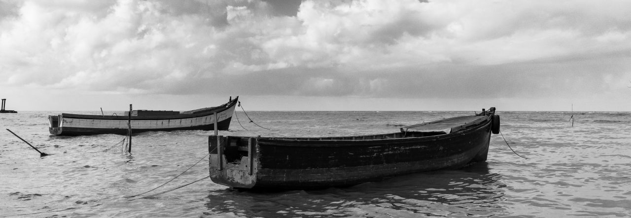
The second image I processed in black and white to articulate the relationship between the clouds in the sky with the sands on the ground, the change from dark to light in both the sky and the land as they meet at the horizon, the sharpness of the shadow from the midday sun, and the contrast between the flags on the pole so close to the viewer against what seems to be a smaller post in the distance to the left of the frame.

These are my decisions, they may quite well not be anyone else’s choice.


In the end, these are choices I make in how I express myself artistically now, it is not how I did it a few years ago, it may not be how I do it five years from now.

Click on the images to see them in their respective galleries.

2014 Deck – Week 12

For this week I actually had quite a few photos to choose from, mostly along the seawalls.  Fidal Bassier had invited me along to shoot with him, he was doing part of a photo-shoot for Miss Earth Guyana, Ms Stacy Ramcharran, and even though I was late getting there, I decided to stop anyway and see what was going on.

The talented team from Bravo Arts under the direction of Steve Bravo had already done an amazing job of the body paint etc., and Stacy’s entourage were well in attendance and assisting her with all the necessaries.

Fidal was setting up on a mound on the southern side of the National Park, the winds had picked up a bit and he asked me to help hold one soft-box in position while I was there…  but I’m a photographer, and I just couldn’t resist the urge to click the shutter button.

Whilst holding the soft-box in one hand (the wind was trying very hard to tug it out of position and out of my hands), I slung my backpack to the side and extracted the camera with one hand, the lens on the camera would have to work… it was the Sigma 10-20mm, so I suspected that cropping after was most likely.

I took only two photos, mainly because Fidal decided at that moment to switch locations, and by the time we had set up at the next spot, it was time for me to say adieu.  One photo I had cropped and sent to Stacy, she ended up using it as the Cover image for the official Facebook Page for Miss Earth Guyana 2014:

IMG_3953-2


The second one, I did not crop, it was the one I preferred, and I had decided since then that I would likely use it for the Deck project, so here it is:


Click on the image to see it in the Gallery along with other images from this year’s Deck Project

All-in-all, it was educational to watch these folks at work, and that I clicked the shutter twice, and got two photos that were usable, I feel good 🙂

Mashramani Children’s Parade 2014

Although I am much behind in my current Deck Project, I thought it prudent to choose and process photos from last weekend’s Children’s Mashramani Parade.

As usual, I am seldom disappointed with the parade itself, the Children are always great to see, I often say it is better than the Adult’s Parade…

I will be making a shortlist of these photos soon, but for now you can click on the image below to see the current images in the Gallery

Mash - Kids 2014


Alone in the Crowd

This was the photograph I had in mind for last week’s Deck Photo, but then the horse-cart took over  🙂

I still find it amazing that in a crowded room or a public place full of people, I can be next to my wife, and feel as if we’re alone, just the two of us.  It was one of those things you read about in poems and novels but didn’t quite get until it happened to you.  For more than half of my life, that has been us, I can look into her eyes and we’d be alone wherever we were.  I look forward to many more years like that.

Well, I took this photograph, so it’s not of us, but you get the idea 🙂  Happy Valentine’s Day everyone!

Click to see larger on the site.

A Touch of Colour

I often remark to Nikhil that he should start a collection called “A Touch of Colour”, or in his case “A Touch of Red”.  He usually finds these scenes where there is one item of colour, usually red, that stands out in his compositions 🙂

While processing these two images I remembered what I so frequently tell him and decided to title this blog-post with this same concept.

The first image is an image that has been selectively desaturated to emphasize the Red, the processing is unusual for me but I rather liked how it turned out this time.


Red Cap - selective desaturation

The second image was not treated in the same way, it was of some gaily coloured flowers against an old almost colourless background, I went close with my zoom lens and worked to get some nice bokeh from the background.


Cat-tails

The Deck – Week 26

I think that, if I calculated correctly, I am now halfway through The Deck  🙂

This week’s image was taken on one of those “walkabouts” I sometimes do with Nikhil.   We had decided to go into a part of Queenstown and walk a couple blocks.  That part of Georgetown has always had some picturesque areas, and I certainly wasn’t disappointed with the walk.

This image was of a corner building that was being brightly illuminated by the afternoon sunshine, and its colours are part of what we in the Caribbean had become accustomed to seeing, nicely sprinkled amidst the “normal” white buildings. (click on the image to go to the site itself)

As was pointed out to me recently, only when we Caribbean people travel to the “Great North” do we miss our colourful heritage; this image is an appreciation of parts of that heritage, from the colours to the “Demerara shutters”

I am proud to be a Guyanese, and like the great Dave Martins referred to it, I have my “Caribbean Belly”