I had mentioned in a previous blog (or two) that at the end of last year, some of my images had found their way into three Calendars for 2013. I recently blogged about the one from Banks DIH, today I turn to the other two, I don’t want them to feel left out.
As someone who has worked in the Computer Graphic Design field for a number of years, I can tell you that some Calendars are in themselves works of art. The standard multi-page calendar normally carried a photo at the top and the date pad at the bottom, this is nice for us photographers who don’t like people “troubling/editing” our images, it leaves the image alone at the top, simply as what it is… a photograph.
Other calendars are designed to incorporate the photograph into the design of the Calendar and these tend to be more conceptual or themed, and can be surprisingly pleasing to the eye.
Having a photograph used in a Calendar is a big deal for us, especially since most of the ones we see use “foreign” images.
The Banks DIH Calendar was designed and produced by Xc!aim Media, the one that featured photos on each page that were mine was from Maggie’s Snackette and Catering Service, it was designs and produced by F&H Printing Establishment and the last one (but not least) was one that featured images from myself and Nikhil Ramkarran, and it was from NT Computeac, designed and produced by Duane Ton-Chung at Micropoint Graphics.
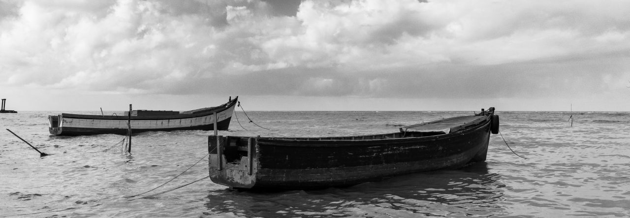
Below you’ll find the images for the flats that contained our images (the artwork remains the copyright of the companies and individuals as listed above, the photographs in the Calendars are copyright to the photographers, namely myself and Nikhil) 🙂


The Maggie’s one looks great, the NT one not too bad either. But I really didn’t like how the NT one looks in print. It is very soft, low resolution and low contrast. Ah well, what can you do?
Agreed, there was something amiss with the print of the NT Calendar… the City Hall photo especially lacked saturation 🙂