Everything is a matter of perspective, that’s one of the reasons I titled this photo just that… “Perspective”

Perspective | Instagram | Samsung Galaxy S5 Mini Duos
Click on the image to see it in the Gallery.
Photography; I shoot what I like, and sometimes people like what I shoot. All photos are copyright to Michael C. Lam unless explicitly stated otherwise.
Everything is a matter of perspective, that’s one of the reasons I titled this photo just that… “Perspective”
Perspective | Instagram | Samsung Galaxy S5 Mini Duos
Click on the image to see it in the Gallery.
I had mentioned somewhere (might have been Facebook) that as artists (photographer, artist… whatever) we find the strangest subjects to focus our attention upon.
This photo and the way I took it is nothing new, others have done it before, many others will do it again, but I like it!

Canon EOS 60D | Sigma 10-20mm | 1/160s at f/9.0, ISO100
Annandale, East Coast Demerara, Guyana
Click on the image to see it in the Gallery along with other images from this year’s Deck Project
Other than being in the Guyana Photographers’ Facebook Group, I’m also a member of a few other Facebook photography groups… one of them is the Guyana Mobile Photographers, which focuses on photographs taken with mobile devices, such as my phone. There was a suggestion of there being “challenges” for the members to push themselves, I had just walked out of the Cathedral of the Immaculate Conception on a Sunday morning when Avinash suggested to the group to use “worship” as the theme, I quickly ran back inside with the phone in hand to see what I could snap… I couldn’t believe my luck at this scene.
From the time I uploaded it I knew that I’d be using it as the Deck Photo for that week…

Samsung Galaxy S5 Mini Duos | Instagram
Click the image to see it in the Gallery, you can also check out how my experiment with mobile photography is going over on Instagram.
I almost regret using the photo “Removing the Lines” for the Four Days, Four Photos challenge that James Broscombe had set for Nikhil and I… It is a photo that had something to say… and would have allowed me to have something to say too 🙂
That left me going through the rest of my week’s haul looking for something that stood out 🙂
Although I go out with hopes of getting nice landscapes or seascapes, I am usually also looking for anything else that might be useful to my own vision of my photography, and recently, I’ve been shooting some unusual scenes (for me, anyway)
This is one I think that is more Nikhil’s subject type, but not necessarily his style, There was something about the way the shadow fell that caught my attention, and then the way the shadow changed as the surface upon which it fell changed made me look again.
In this light (no pun intended) I was drawing a comparison to the way our actions and our attitudes to others often elicit different reactions and responses from each person, while we cannot control or even predict how others react to what we say or do, we should be observant of that reaction, so that we may learn from it, and be aware of it for future reference.
All shadows are not equal, and each shadow changes with the surface upon which it is cast, sometimes the shadow is sharp, and defined, at other times it can be diffused or even murky.

Canon EOS 6D, Canon 24-105mm | 1/320s, f/10, ISO200
Click on the image to see it in the Gallery along with the other images so far from this year’s Deck Project.
On a Saturday after work (which is generally after noon) I try to make a stop along the seawall, just to walk, feel the breeze, and hopefully get a few photos in, the harsh sunlight in the middle of the day is generally considered to be “not the best” light for photography… but for me, it’s the time I have available mostly, so I have to make it work 🙂
I’ve walked past this particular piece of wood many times, but never saw anything I wanted to shoot… that happens a lot to me, but this day, the sky had some nice striations, after squinting and peering at the sky for a while I decided it had enough detail to work with for what I had in mind 🙂

Thomaslands, Georgetown. | Canon EOS 60D, Sigma 10-20mm
Click on the image to see it in the Gallery along with other images in the 2015 Deck Project.
I think using a particular theme as a guide for a period is a good idea, I am keeping it at the back of my mind while shooting, but not letting it dictate the photos in general, so while I am shooting the things I see and like, I am also on the lookout for the thematic image as well.
This one I had driven past and then reversed quickly to get the shot, luckily it was a Sunday so the traffic was a bit light 🙂
Obviously, the square is the window… but those colours!!! I love the Caribbean for scenes like this 🙂

Canon EOS 6D, Canon 24-105 | 1/400s, f/8.0, ISO 200 @105mm
Click on the image to see it in the Gallery, along with some other “Odds and Ends”
That photo I used for Week 44 was different, yes, I think it’s good, is that what I want to be doing at this time?
So, back to our regular programming… a high contrast monochrome from the seashore. I was hoping that the fisherman/sailor would just sit and stare at the sea for a while, at the time I shot this I think he was securing the bow line.
This is a scene that was a no-brainer for me, it had everything I usually want… Jhandi flags, a boat, a fisherman, a good sky and little garbage in sight within the frame 🙂

24mm, 1/1250s, f/5.0, ISO 200
Click on the image to see it in the Gallery along with other images from this year’s Deck Project
People write all sorts of things in the sands at the seawalls… and beaches worldwide, from Love Letters (Pat Boone sang about this), to drawings, to directions to the nearest Qik Serv, to Hearts with cupid’s arrows through it and the Lovers’ names inscribed, all to be washed away with the next high tide.
Those messages are as transient to us as we are to the timeless sea; and yet, we keep making those markings and the sea wipes them out again.
I snapped a photo in passing this fellow as he used quite a long stick to mark out something in the sand, I have no idea what it was he was drawing, maybe it was a message to an extra-terrestrial ship 🙂

Midday Markings – Kingston Foreshore, Georgetown.
Click on the image to see it in the Gallery.
Exploitative or Journalistic?
The question with regards certain street photographs is usually whether the resultant image and its use are exploitative or journalistic; this is not a question for viewers or critics, it is a question for the photographer; anyone says otherwise is trying to be self-important; yes, a fallacy, I don’t care. 🙂
I saw this chap sitting in what seemed a dejected and sad position, and I “had” to take a photograph, but carefully, surreptitiously, so as not to make him too aware of my intentions; wanted the scene as I saw it to be portrayed as I remembered it…
In the shadows cast by the trees along the avenue, in the bright midday sun, one man, sitting, alone, almost overlooked, in the heart of Georgetown.
I titled this one “In the Shadows”, because that is how I see many of our fellow citizens living; in the shadow of oppression, in the shadow of others who walk along with a brighter present and future than he may have, in the shadow of trees and buildings that have existed longer than he has, in the shadow of a life that could be better, but isn’t (reasons unknown).

Cropped to 3:4 from the original
1/125s @ f/7.1, 24mm, ISO 200
Click on the image to see it in the Gallery.
.
When film (or plate) was the way to capture photographs, there were many many debates, just like there are now. They didn’t debate sensor sizes, they debated film sizes (and that had so many I won’t even start on that), and just like many enthusiasts and professionals now debate colour vs monochrome, so it also went back then.
While there were specific films developed for both types back then, in the digital age we are pretty much guaranteed that the camera you buy, whether the one in your mobile phone, compact camera, mirrorless or DSLR camera, it will in all likelihood take the photos in colour, which you can then convert to monochrome (black and white, sepia, etc) in post-process, whether in-camera or in software on the PC. This changed when Leica developed their Leica M Monochrom, it was the first major brand to produce a high-end digital camera that produced only black and white photographs, and rumor has it Sony is working on a black and white version of their RX 1. I don’t want to get into a debate myself over the need or desire to have a camera that only shoots monochrome, I can only say that it is unlikely I would ever buy one myself, but that is probably only my wallet talking.
In the genre of Street Photography, there is usually a preference for black and white images, but there are many many great coloured Street Photographs out there, more than you’d think. Henri Cartier-Bresson’s work in street photography was very definitive for the genre, and all his work was in black and white, he also experimented with coloured film but was never satisfied with the results; of course, he only had access to the types of film available then (the 1950s) and if you look back at coloured prints from those days you’d see the limitations of the coloured film of the time. I dare say that if he had lived in a later era, he may have at least given the coloured films a chance.
When I first started taking photographs on a slightly more serious basis than just snapshots, I didn’t do much black and white processing, and even when I did, it was more for the novelty than because I knew why it should be done and to which photographs. Now I do a lot more processing in black and white…
What have I learnt that changed my views?
I’ve learnt that not all photos look good in monochrome, the tonal range and subject matter is very important for an image to look good in monochrome. Monochrome images tend to showcase textures, shapes and form better, and by removing colour from the image you are left with just the elements that make up the composition, and if those elements are not functioning correctly in the overall composition, it will feel off, or look cluttered.
When used correctly, colour will catch the eye and hold it, this works for some compositions, but for others, that same thing tends to shift the focus of the viewer from the overall composition and have them concentrate almost solely on one portion of the image.
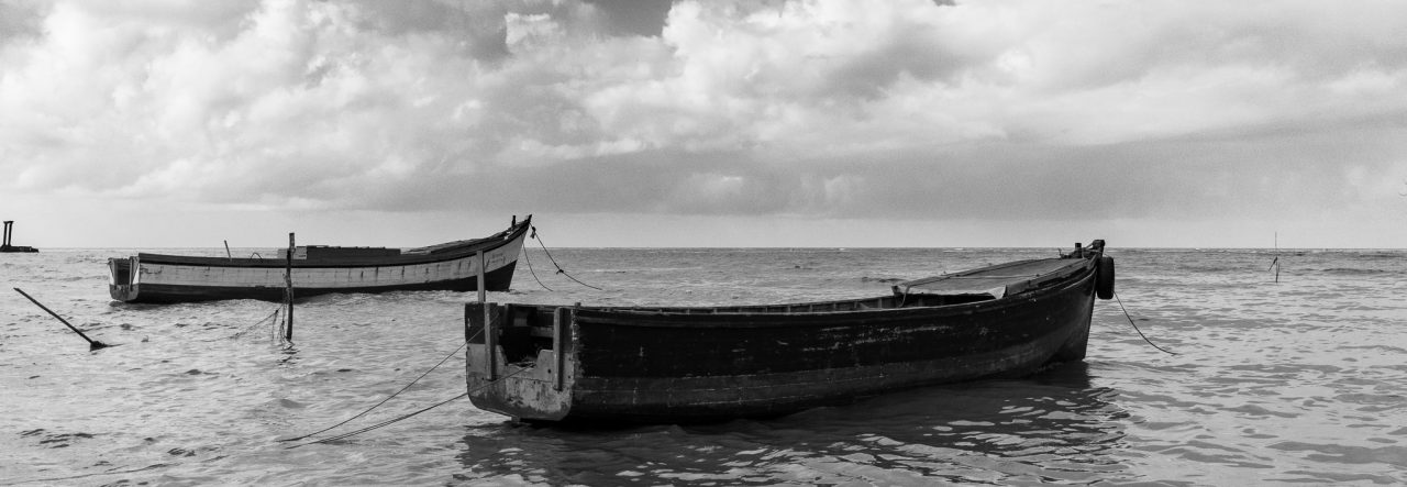
I’m no expert, but this is how I see it; recently I took a few photographs of some Jhandi flags on the Kingston seashore, and I chose two that I liked, and I processed them quite differently, and primarily for the reasons stated above.

This one I chose colour, because the main subject and the focus of the image is the Jhandi flags themselves, the various colours chosen as they contrast with each other, the browns of the sand and the blues of the sky.
The second image I processed in black and white to articulate the relationship between the clouds in the sky with the sands on the ground, the change from dark to light in both the sky and the land as they meet at the horizon, the sharpness of the shadow from the midday sun, and the contrast between the flags on the pole so close to the viewer against what seems to be a smaller post in the distance to the left of the frame.
These are my decisions, they may quite well not be anyone else’s choice.

In the end, these are choices I make in how I express myself artistically now, it is not how I did it a few years ago, it may not be how I do it five years from now.
Click on the images to see them in their respective galleries.
